Project III: Portfolio

Project III: Portfolio

Format Link

The final project of the 1. semester was an individual task to create a portfolio, that would communicate our personal brand, show our work, tell something about us and attract possible customers/clients from our target group. The students were supposed to show their ability to plan and implement the portfolio, to show that we are able to implement the theory from classes into an actual product and to argue for our decisions.

The hand-in was a hand-coded website written in HTML and CSS that validated as a webstandard and a report of maximum 12000 keystrokes made in InDesign. The webpage must visibly show our target group, personal brand and some outcomes and products from the first semester that we consider interesting for the target group. The portfolio must also be available online.

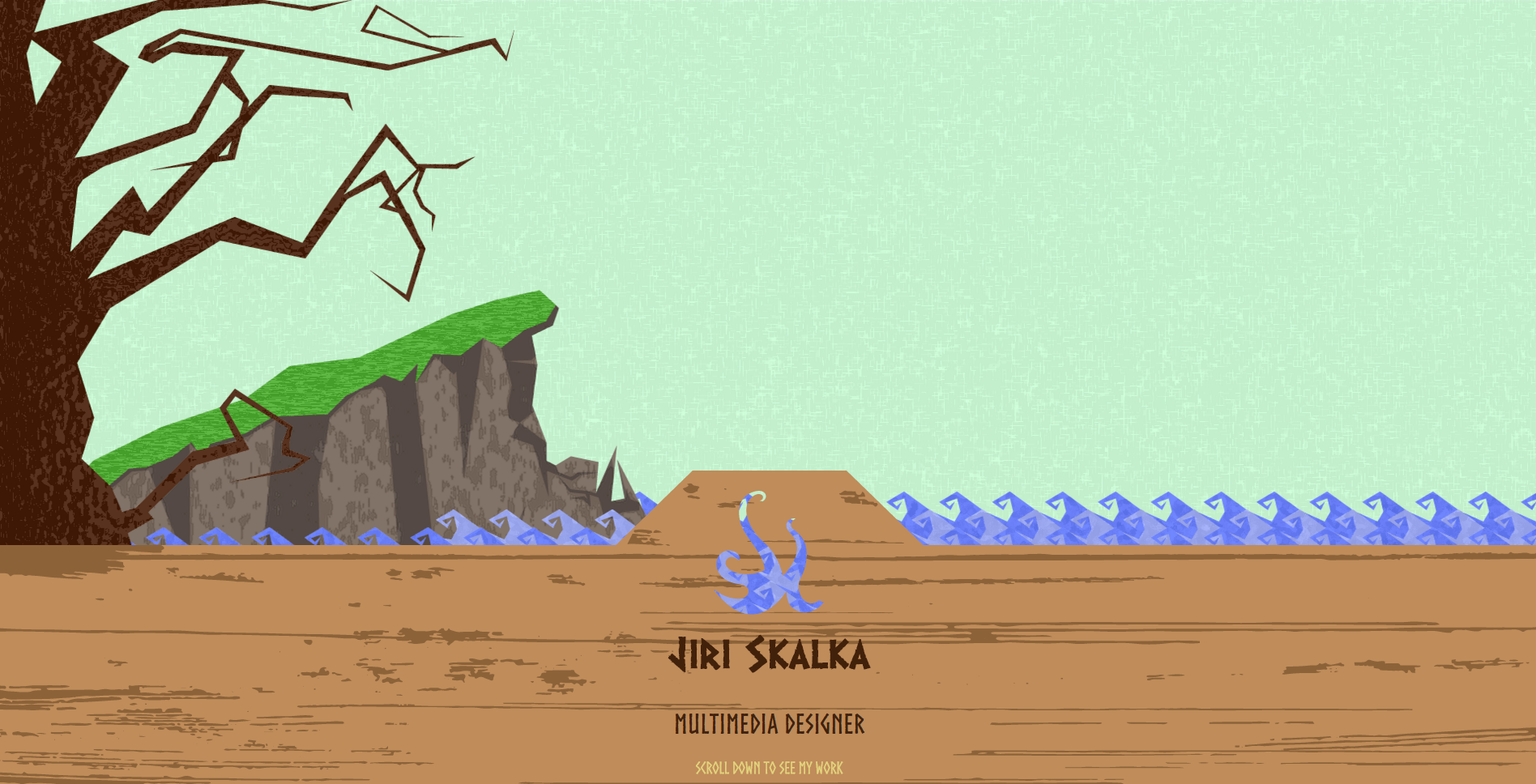
For this project, I created an one-page portfolio that is designed in my art style and that uses HTML5, CSS3 and some JavaScript. That way, I want to show my abilities as a Multimedia Designer. I chose the one-page design as it is important to make a good first impression on the visitor in several seconds, which is done easily in a scrolling page. I show my work first to keep their interest, then moving to some information about me and lastly giving them some contact information with a possibility to send me an e-mail through a simple form.

The portfolio is available Here

facebooktwitterlinkedintumblrmail
Form website for the Cereal Box Project

Form website for the Cereal Box Project

Format Link

As another part of the Cereal Box Project, we were supposed to create a landing page with a form for the QR code located on top of the cereal box itself. We were completely free to choose what would this form be for, however, we had to make a fully functioning one, so that if some PHP code was added, the form would actually work. I chose to make a form for a newsletter with a chance to win a month supply of my product for five people with a small catch. There is no way somebody would win… try to find out why Here

facebooktwitterlinkedintumblrmail
Mascot for the Cereal Box Project

Mascot for the Cereal Box Project

Format Link

This task was one of the many parts of the Cereal Box Project. The students were supposed to create a mascot for their cereal product that would fit their idea. To gain new insights onto the project and some inspiration to it, we were then supposed to colour the mascot using three different colour schemes.

facebooktwitterlinkedintumblrmail
Cereal Box Project

Cereal Box Project

Format Link

The Cereal Box Project was a long term individual task that we were working on from the beginning till the end of the 1. semester. This project was meant to test our visualisation skills, as well as our ability to use Adobe Illustrator. Throughout the whole process, we had to create our own brand, use many visualisation methods, make a mascot (can be seen Here) and a landing page with a form for the QR code on the cereal box (see Here). Although we were free to create a box of any form, most of the 1. semester stuck with the classical block shape. I created a pyramid shaped box resembling a volcano as that fit the whole idea of my product, which was Chilli Chocolate Mint flavoured cereals.

facebooktwitterlinkedintumblrmail
Project II: Installation concept for Odense Bunker Museum

Project II: Installation concept for Odense Bunker Museum

Format Link

Project II: Installation concept for Odense Bunker Museum was a collaboration with the mentioned museum located in Odense, where the students in teams of four were supposed to redesign and reinvent the way the museum communicates information to the 10% of the visitors who don’t take the guided tour. Every class from the 1. semester of MMD got a different room to work on.

The main point of this project was to enhance the Museum experience for the visitor that choose to experience the Museum on their own by creating innovative installation concepts. Our team approached this task by creating an exhibition that gives the experience of the museum acoustically, eliminating all needs for modern devices while still leaving an opportunity to use them if needed. The idea was to create a helmet with special headphones. This helmet would then, when put onto the visitor’s head, play an immersive and educative story that would put the visitor in a position of a member of the Civil Defence, giving them a dilemma with two choices where both lead to a different ending.

The two prototypes of this exhibition can be seen Here

facebooktwitterlinkedintumblrmail
Project I: Analysis of SME website

Project I: Analysis of SME website

Format Link

In Project I, our job was to analyse, formulate actionable recommendations for and re-design a SME (Small and Medium size Enterprise) website. For this project, we were able to choose one from five websites of Latvian companies and use our teams ability to make an in-depth analysis of the chosen one. According to the analysis, the teams were then supposed to recommend changes for the company to improve the user experience of the website and to help them enter the international market.

Our team has chosen the website of the company Tastecaps. In a week, we were able to analyse the website, recommend changes for it and implement them in a mock-up of the webpage.

The animated mock-up can be seen Here

facebooktwitterlinkedintumblrmail
CSS3 animation workshop – Battle Snail

CSS3 animation workshop – Battle Snail

Format Link

On the 10th of November, our class took part in a CSS3 animation workshop. The task was to make a storyboard for our animation to help us to know how many steps we would need.
Probably the hardest part of this work was to come up with an idea that would be complex enough so that I could include as many animation principles as possible.
I managed to make all the sprite sheets on time, however, I had problems with exporting them in the right size, and therefore I did not complete the animation on time and couldn’t participate in the contest at the end of the workshop.

I made 35 pictures, 32 of them are in 3 sprite sheets.

Animation principles:
1) Squash and stretch
3) Staging
5) Follow through and overlapping
6) Slow in and Slow out
7) Arcs
8) Secondary action
9) Timing
10) Exaggeration
11) Solid drawings
12) Appeal

I wanted my animation to be 500px X 500px. First I created new file in Adobe Illustrator that was big enough to fit all the steps of one part of the animation. Then I divided in a number of tiles equal to the number of steps I wanted and started working on the images. When I was done, I exported them to the same folder I had my html file in. Lastly, I coded all the parts of the animation in, made sure each part of the animation was overlapping the other parts as it should with z-index and put the whole thing in the middle of the page.

Here is the final animation: Battle Snail

facebooktwitterlinkedintumblrmail
Moving Art Project

Moving Art Project

Format Link

This was the second workshop of the 1. semester. We were supposed to pick a painting and make an animation from it. Part of this workshop was making a storyboard, working with Adobe Photoshop and Adobe Edge Animate.

I have chosen a painting by Dutch artist Piet Mondrian. Main part of his work from his early career is impressionistic or naturalistic. Around the year of 1905, he started to limit his palette to only a few basic colors as well as make his work more abstract. In 1917, Piet created his own movement called neoplasticism.

The painting I have picked is called Evening: Red Tree. He finished this piece of art in 1910 and it can be seen in the Municipal museum in The Hague. It captures the shift in his career from impressionism to abstract art.

When I was choosing the painting I wanted to work with, I was looking for one that would bring me an idea to an animation right from the first sight. After some research, I found this one and knew immediately what I would like to do with it. That’s why I opted for this piece.

Animation principles:
2) Anticipation – I used this principle at the start of the swinging
5) Follow through and overlapping – I tried to use this principle at three points; when the branches move in the wind, when the person stops and when the swing is in the highest point
6) Slow in and Slow out – I have used this principle with the swing, as it stops at the top and moves the fastest when in the lowest level
8) Secondary action – branches moving, fog going over the scene
11) Solid drawings – I used this principle on the person and the swing, so that it would look a bit more real

So here it is, the animation itself: Moving Art Animation

P.S.: This is not the final version of the animation, as I want to add some background music to it and make it overall better.

facebooktwitterlinkedintumblrmail
Adobe Edge Animate animation

Adobe Edge Animate animation

Format Link

This animation was made to fulfil an assignment for our Interaction class. From many ideas I got throughout the week we had for this homework, I chose this one simply because I liked it the most, thought it would be the funniest one and also that it would meet all the criteria the easiest. So, here you go :) My animation

facebooktwitterlinkedintumblrmail
Jablonec Watchtowers

Jablonec Watchtowers

Format Link

This is my graduation exam work. It is an online presentation of the view from the watchtowers around Jablonec nad Nisou, Czech Republic. The view is done as spherical photos, which are then placed on a webpage, which I designed and coded myself except for some of the JavaScripts. This work was assessed as really good by the graduation commission. The whole work is in Czech language, I can translate it to English if needed.

Link: here Jablonec Watchtowers or here Jablonec Watchtowers

facebooktwitterlinkedintumblrmail